Patina skins
Every Patina app can be skinned with the same TOML files, in the suite skin format, version 1. The format began as UnAmp's skins (UnAmp ADR-0024) and moved here in ADR-0004.
- Shared sections:
[colors],[controls]and[window]mean the same in every app, and Patina applies them. - App sections: each app's own parts go under
[app.<name>], e.g.[app.unamp]. An app reads only its own section and skips the others. - Forward-compatible: a file written for a newer version of the format still loads, with a warning.
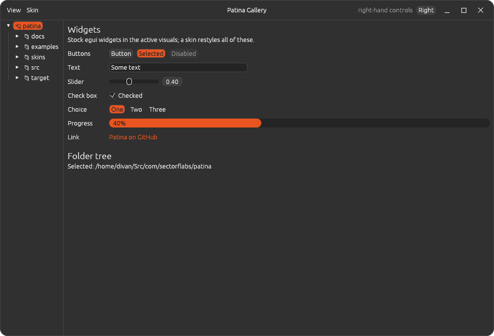
Which skins an app offers
| Skin | Where | What |
|---|---|---|
| Default | Built in, no file | Stock egui, following the desktop's light/dark setting |
| Dark Orange | Patina's skins/dark-orange.toml, in every app |
Yaru-style dark greys and Ubuntu orange, the look Photograph was built in |
| Calendar | Patina's skins/calendar.toml, in every app |
A deep red title bar (freebsd.org's red) over warm off-white paper; Calendar starts in it |
| Notebook | Patina's skins/notebook.toml, in every app |
A leather-brown title bar over cream paper; Notebook starts in it |
| Steam Classic | Patina's skins/steam-classic.toml, in every app |
The olive-green VGUI look of the 2003–2008 Steam client, square corners; its comments document the format |
| An app's built-ins | Compiled into that app | Anything only that app should offer |
| Yours | ~/.config/patina/skins/*.toml, read by every Patina app, plus any folder of the app's own |
Anything |
A skin with the same name as one listed before it replaces it. That's how you customise a
built-in: copy it into your folder (apps offer "Copy built-in skins to folder", which never
overwrites) and edit your copy. Delete the copy to go back to the built-in.
Problems are shown in the app's skin menu:
- A bad value, such as
text = "green", is an error, and that skin is skipped. - An unknown key is listed, but the skin still loads. A misspelt
bakgroundgets caught this way without breaking anything.
Writing a skin
A skin varies the look, never the layout or behaviour: that's what keeps Patina apps recognisable however they're skinned (see Unity in variety in design.md). Within a skin, vary one thing boldly and keep the rest calm: unusual shapes with a narrow palette, or a bold palette on the stock shapes.
Every key except format and name is optional. Any colour you leave out keeps egui's
default for the base skin, so a skin can be as small as this:
format = 1
name = "Just Purple"
base = "dark"

[colors]
accent = "#8A2BE2"
Colours are "#RRGGBB" or "#RRGGBBAA". Use Dark Orange as a full
example.
Top-level keys
| Key | Type | Meaning |
|---|---|---|
format |
integer, required | Skin format version: 1. A file without it is UnAmp's old skin format and is rejected. |
name |
string, required | Name in the app's skin menu. Matching a built-in's name replaces it. |
author |
string | Shown in the skin menu. |
base |
"dark" or "light" |
The egui theme (light or dark) the skin starts from. A skin fixes it; only Default follows the desktop. |
corner_radius |
integer (px) | Rounding of panels, menus and controls. 0 is square. Also the main window's corners, unless [window] corner_radius is set. |
shadows |
bool | false removes window and popup shadows. |
[colors]: the base palette
| Key | Used for |
|---|---|
background |
Panels, and the windows inside the app |
surface |
Inset areas: text fields, lists, slider tracks |
surface_alt |
Alternate rows in lists |
border |
Outlines of windows and panels (and of controls, unless [controls] border is set) |
text |
Normal text |
text_strong |
Headings (and text on hovered controls, unless [controls] text_hover is set) |
text_weak |
Secondary labels (section headings, counts, status) |
accent |
Selection, slider fill, toggles that are on |
accent_text |
Text drawn on top of accent (e.g. a selected item) |
link |
Links, and the current item in lists |
warning |
Warnings |
error |
Error messages |
[controls]: buttons, sliders, checkboxes, drop-downs
| Key | Used for |
|---|---|
background |
A control at rest |
hover |
Under the mouse |
pressed |
While pressed |
text |
Text and icons on controls (defaults to colors.text) |
text_hover |
Text on hovered or pressed controls (defaults to colors.text_strong) |
border |
Control outlines (defaults to colors.border) |
egui draws buttons with one fill and slider/checkbox tracks with another. Tracks at rest use
colors.surface, so they stay visible when controls.background matches colors.background.
[window]: the app's own frame
Every Patina app draws its own title bar and window edge (patina::frame).
| Key | Used for |
|---|---|
title_bar |
The title bar's background (defaults to colors.background) |
title_text |
The window title (defaults to colors.text) |
border |
The one-pixel window edge (defaults to colors.border) |
corner_radius |
The window's corners, in px. Defaults to the top-level corner_radius, else 15. Square while maximised. |
When title_bar differs from colors.background, the bar's own menus and buttons are drawn in
title_text, with [window.controls] hover and pressed fills, so they read on the bar's colour
(as in Calendar and Notebook). Their menus open in the skin's normal colours.
[window.controls]: minimise, maximise, close
These are skinned separately from [controls], so the window buttons can look like a title bar's
and not like the app's buttons. Each falls back to the matching control colour.
| Key | Used for |
|---|---|
icon |
The symbols at rest |
icon_hover |
The symbols under the mouse |
hover |
Background under the mouse |
pressed |
Background while pressed |
close_hover |
Close's background under the mouse (default red, #c01c28) |
close_icon_hover |
Close's symbol under the mouse (default white) |
[app.<name>]: an app's own parts
Each app documents its own section. For example, UnAmp's [app.unamp] colours its spectrum
analyzer and time display (see UnAmp's docs/skinning.md).
For app authors
use patina::skin::{self, Skin};

// Default, Patina's built-ins, the app's own, then the user's folders.
let built_ins = [skin::BUILT_IN, MY_BUILT_INS].concat();
let dirs: Vec<_> = skin::shared_dir().into_iter().chain(my_app_dir()).collect();
let (skins, errors) = skin::load_all(&built_ins, &dirs);

let chosen: &Skin = &skins[i];
chosen.apply(ctx);                                     // egui's visuals
let frame = chosen.frame_style(ui.visuals());          // every frame; Default's follow the desktop
let (mine, warnings) = chosen.app_section::<MySkin>("myapp")?;  // your [app.myapp]
Name your section after your app, and use role names for its keys, the way the shared sections
do. The gallery's Skin menu (examples/gallery.rs) is a complete example.